- Events
- Managing cartographic collections spatially
Managing cartographic collections spatially
Part of Connecting to collections 2022 series
Video | 1 hour 5 mins
Event recorded on Tuesday 18 October 2022
Ever wondered how to visualise a cartographic collection? This talk in the Connecting to Collections series illuminates the process of fusing maps’ classification system with spatial tools to manage and care for the national cartographic taonga. Igor Drecki, Curator Cartographic and Geospatial, describes how it is done at the Alexander Turnbull Library.
Transcript — Managing cartographic collections spatially
Speakers
Joan McCracken, Igor Drecki
Welcome
Joan McCracken: Ko Joan McCracken aho.
I'm with the Alexander Turnbull Library's outreach services team and I'm delighted you've joined us today, to learn more about the library's cartographic collection, with curator Igor Drecki.
To open our talk today, we have, as our whakatauakī again, a verse from the National Library's waiata, Kōkiri, kōkiri, kōkiri, na our Waikato-Tainui colleague, Bella Tarawhiti.
Haere mai e te iwi
Kia piri tāua
Kia kite atu ai
Ngā kupu whakairi e
A little housekeeping before Igor's presentation. As you'll have seen when you joined the webinar, we are recording it. And as this is a webinar, your videos and microphones are turned off. However, there's still an opportunity to interact with those of us in the room and with others in the audience.
If you'd like to share where you're joining us from, have any general questions or comments, then please add them to chat. If you have any questions for Igor, then add those to Q&A. You'll find both buttons at the bottom of your Zoom screen. I'll be monitoring chat and Q&A. At the end of the presentation, I'll come back and ask Rhonda any questions we receive.
We will also be adding some links to chat during the presentation. If you want to save those links, click on the ellipsis, the three dots beside the chat button, and select save chat.
I'm now delighted to introduce the Curator, Cartographic and Geospacial at the Alexander Turnbull Library, Igor Drecki. Igor trained as a professional cartographer and worked in the private, local government, and academic sectors, before joining the library in 2021. As he says, "Cartography and maps have always been at the heart of my professional pursuits."
We're really looking forward to your presentation, Igor.
Introduction
Igor Drecki: Thank you Joan for this introduction and good afternoon everyone. In making this presentation, we want to acknowledge that the work being discussed here is in preliminary phase only. Any opinions expressed in this presentation concerning the use of spatial tools in managing and caring for the libraries cartographic collections are my own. Your questions or comments on the scope and direction of this project, including benefits to the researchers, would be most welcome.
We are very serious about collecting at Turnbull. Our collecting plans need to reflect the National Library of New Zealand Collections Policy, which relies on trusted experts to ensure our national taonga and is collected and made available with integrity and care. It also relies on knowledge augmented by spirit of collaboration, which supports research and innovation to the benefit of all New Zealanders.
The Cartographic Collection is a national collection developed and maintained to sustain advanced research in the cartography of New Zealand; in depth research in New Zealand, Pacific and Antarctic studies; and to preserve documentary heritage in perpetuity.
Understanding these strengths and weaknesses informs the strategy that drives its development. This understanding, though, is often limited and reliant on written documentation and human memory. Visualizing the Alexander Turnbull Library's Map Collection could equip us with a powerful tool that enhances the way we care for and grow the nation's cartographic Taonga. It could inform the collection development plan, identify unrepresented geographies, and guide us in making even better decisions on donations and purchases.
Joan McCracken: Excuse me, Igor, just a quick stop because people are having difficulty hearing us, so I'll just see if we can sort that out for our audience.
We seem to have a mix of responses here. Some people are hearing us fine and some people are not. So I'm not sure. Sound is fine from somebody else, so. I think just carry on at the moment, Igor and we'll see what we can do.
Igor Drecki: Well I'll repeat a part of what I already said. Visualising the Alexander Turnbull Library's map collection could equip us with a powerful tool that enhances the way we care for and grow the nation's cartographic Tonga. It could inform the collection development plan, identify unrepresented geographies, and guide us in making even better decisions on donations and purchases.
Furthermore, harvesting catalogue records to build suitable databases for visualisation could reveal various inconsistencies which, once addressed, would lead to better descriptive records.
This preliminary research is undertaken in collaboration with associate Professor Tony Moore from the National School of Surveying, University of Otago. His contribution is mainly concerned with harnessing and adopting leading edge computer science research that developed in the last decade, to visualise and analyse social networks. Although this work has not yet entered the realm of visual analytics, he also contributed analytical functions in processing data for visualisation.
Translating map classification into data
Translating map classification into data is about harnessing the geographic classification system — in our case, it's called Boggs and Lewis — to extract the spatial, as well as temporal and thematic components of maps call numbers and creating the database.
So here is a representation of our map collection. And every map has got a call number written on it. And this call number is the source data for our project.
So let us look at an example here. So this is a call number that we will look at a bit more closely now. So here it is. And it's made out of four components.
So the first component, in green, concerns the area. The second component, in red, concerns the theme of the map. And then the third component is about the date. The 4th component, accession number, is there in order to make every single map in our collection unique, so that every map has got it's unique code and unique number in order to retrieve it or to work with it.
So let us look at each one of these components, one by one.
First component — Area
So the area, the spatial component of maps call numbers, is recorded according to area classification schedule. So for the, this schedule covers the entire world. And it starts with triple zero, which is the universe; through 100, which is the world; then 200 and 300 is Europe; and so on. And 800 is Australia and New Zealand.
Also, what is important to us that 900 includes oceans, which then cover nations that are in the South Pacific. So this is also a code that is quite representative in our collections.
So in New Zealand we use the extension of the original schedule, which is based on old provinces, and is further expanded for counties, towns with a population of over 1000, and the suburbs and large urban centres. New Zealand is 830, extending to 837 for offshore islands, from Kermadecs to the North, to Campbell to the South.
Here we've got an original document that is maintained at the Turnbull Library that divides New Zealand into these areas. So as I mentioned, it is based on the old provinces and that's why we've got a few numbers that reflect these old provinces.
But it actually starts with all of New Zealand, which is 830. Then we've got a code for the North Island which is 832. We've got the code for the South Island, which is 834. We also have a code for the Cook Straight, which is 833; extending to Stewart Island, 835; and finishing off with Chatham Islands and other offshore islands at 837.
We then look into old provinces and we add in a single digit to the call number. So here we've got a number, 8321, for the Northern North Island, which actually coincides with the old Auckland Province. We've got also 832.2 for Taranaki, .3 for Hawkes Bay, and .4 for the old Province of Wellington. And similarly, with the South Island, we've got 6 old provinces and each one of them would have decimals from one to six.
So our code, as you probably recall, is 834.1, which corresponds to the South Island 834.1, which means the Nelson area.
We also have codes which are actually not quite covering areas. Well, Southern Alps does cover area, but it's not actually according to the old provinces of counties.
So I already talked about provinces, and then we move further, zooming in to some areas. And in the original scheme, we went in to counties. And clusters of counties were given again an additional 2nd digit in the decimal point in the numbering system.
So for Northland, it would be 11, so 832.11. And for example, for South Canterbury, it will be 834.48. Four for Canterbury and eight for its Southern part. Southern Alps does not actually correspond to any counties or provinces. But because we've got a large number of maps that deal with Alpine environment — whether they are maps covering glacial extents, or early surveys or glaciers, or initial surveys done in this area, or explorations — we actually allocated a number that does not quite correspond to a definitive area.
So this is the area component of the system. And interestingly, when we move in into further decimal points, we continue zooming in. So from 3 decimal points up to five decimal points, we're moving into areas covering towns and cities, and also the suburbs — the suburbs for major areas such as Wellington or Auckland.
Interestingly, when the scheme was introduced, you can imagine that these areas are not — for towns and cities — are not quite defined as for the lower numbers, such as counties or provinces. So you can imagine the urban sprawl is affecting the area covered by certain cities.
So Hamilton, let's say in the 1920s, occupied a smaller area than it occupies now. So these areas are fluid to some degree. But obviously, they are concerned with a particular urban centre.
With Wellington and Auckland, we had to introduce a code which is made out of letters. And I will talk about this a little bit further on. This is just because there was not enough numbers in order to cover the particular suburbs by simply following the schedule up to the 5 digits. And I will talk about it a little bit later on.
Second component — Theme
The second component of map classification is the thematic component. And this thematic component is made of letters, in this case. The 1st letter provides a parent, or indication of, the parent records.
So any map that the thematic code starts with A would be part of the journal maps. starting with B will be mathematical geography. That's something to do with surveying, with measurement of land, triangulation. Then we're moving into letter C, which is actually physical geography. Letter D, biogeography. And letter E stands for human geography, that again is subdivided into subgroups or subparent records. F for political geography. G for economic geography. And then H for military and naval geography and science. Letter P stands for history. So looking at our theme here, G, such as it is a part of human geography, focusing on economic geography.
So this is actually a very detailed schedule or original schedule of Boggs and Lewis that deals with thematic layers. And here is our code that was visible on that map, GBHM. And this is something to do with coal, lignite, or peat. So we can narrow it down to a very particular theme of the map in this particular case.
Sometimes this system is not quite intuitive as one would wish. For example, food supply has got 3 letters, but it's at the same level as agriculture, which has got only two letters. So there are some oddities here and there with regards to this schedule.
Third component — Date
Now the third component is the date. And the date refers to the date of information that is on the map rather than its publication date.
So for example, if we've got a map in our collection that refers to the Tasman Voyage that visited the Western coast of New Zealand, obviously that visit happened in 1642 and the map has been produced this year and just refers to this voyage. We will actually provide a date, 1642, for this map, even if it was published in 2022.
So again, the date in the call number reflects the date of information on the map rather than its publication date.
Fourth component — Accession number
The last number is the accession number. And probably some of you might imagine that the 1st three components — area, theme and date — could actually be shared by a number of maps. And that's why we need another component of the call number in order to make every map unique. It could be accession number, as it is here. And also, another option is to use the barcode number, which we also allocate to every map that enters the collection since 2016.
So accession numbers and barcodes provide this unique identification for each map in the collection. And it is important to have it to make every map unique.
So here is our record for the map that you've seen earlier on, one of the maps with the call number written in pencil. And as we zoom in, you will see that this is a map of the Buller coalfield, so that's where I mentioned the thematic code being coal. Map of Buller, which is actually a part of former Nelson Province. So that's why it is 834.1. And the date of the information on this map is from 1914.
And in green, you see also accession numbers. This map is made of four sheets and that's why we've got a range of accession numbers from 51819 to 22. So this is 4 numbers, each for each part of this map in four sheets.
So that's how it works, how we actually encode information for our maps in the Turnbull Library.
Translation to spatial data
Now, however, this is about visualising and we need to translate this information into spatial data. We are fortunate enough that even if this classification system is not new — it has been introduced in 1945 and is being mainly used in North America, Canada, USA, also in Britain as well as Australia and New Zealand — it actually fits perfectly the needs of modern spatial databases.
So you can see that on the left hand side we've got area, theme, date. This is the map classification components. We omit in this case the accession numbers. And we can see the parallel with the way how the spatial data is is constructed. So it has got its location, attribute and time. So the area translates to location, the theme translates to attribute, and the date translates to time. And we can build a database out of it.
So here it is, our original call number taken from the map in the [INAUDIBLE], and we're translating it to the location, attribute and time.
The next step in translating this information into geospatial data, the next step is harvesting our catalogue. So we're looking at the catalogue and trying to see what elements of the catalogue record actually matches these requirements, in order to build a database to then visualise, say, using geospatial tools.
So, small text. However, I'm just alerting you to the two components of catalogue records which we're looking at. The one on the left contains most of the information I talked about — so area, theme and date — while on the right hand side, in small text, we also record the quantities of maps. Sometimes one record could have multiple maps embedded within one record. And this is obviously. important in order to understand the number of maps for a particular location.
So we're zooming in and, as you can see, this is output from our database. We've got area encoding there. We've got thematic encoding there — in this case, A or GBBG. And then we've got a date. In this case we've got date ranges, or a more specific date, although maybe, if it's in square brackets, it is not actually recorded on the map itself. It is something we need to date the map and just put the date there.
So this is what we're harvesting from the database. And then we're converting it into the database, and again, that's the the geospatial database we constructed using Excel spreadsheet. And when we zoom in, we see the location, attribute, time. We also see the accession number and we also see the count. And this is the the data that we use in order to build our visualisations, as a source information, from which we go and and visualise the collection.
We also have the accession number and the title of the map, or title of the group of maps. This is mainly for checking purposes, so that we can narrow it down if there's any issues, we can actually identify a particular map in the collection.
Visualising cartographic collections
So now, having all these done, having this original database already prepared, we can move into visualising cartographic collections. So visualising cartographic collections could take multiple forms — from statistical plots, through network graphs, to maps and interactive tools. What we decided to do here is to concentrate on, initially, the network graphs. And there is a little bit governed by the data that we've got, and I will probably not dwell too much on that at this stage. I would rather talk about what we've done here, and maybe later on cover some future work and what the requirements for these future works are.
A few caveats at the beginning. First of all, the catalogue refers to maps that cover the entire world. So we decided to focus on New Zealand and its offshore islands. We also decided to initially focus on unpublished maps in our collections, as opposed to the published maps. We've got a different catalogue for that. It's kind of an internal thing for us at Turnbull, that we've got a different catalogue for unpublished materials and a different one for published materials.
So this research, so far, focusing on unpublished material. And also, we are focusing on those maps that have, embedded in their call numbers, the area, theme and date. We've got also other materials, cartographic materials, that do not conform to this standard, to the map classification schedule. And these cannot be easily embedded into the work that we're doing with visualisation.
So the caveats, again, are that we're focusing on New Zealand, on physical, unpublished maps. So no, also, digitised maps or map images. And the maps are described using map classification system.
Although the unpublished cartographic collection has around 15,000 records, only about 3600 actually meet the above criteria. Which means that we've got a large proportion of the unpublished material, cartographic material, that we cannot quite easily visualise using this methodology.
Visualisation 1
We begin with visualising geography of the cartographic collection based on area component of the call numbers. And the process of visualising the collection uses leading edge computer science techniques developed in the last decade to visualise and analyse social networks.
So initially this work was in the realm of computer science, but it's spreading out and we're trying to look elsewhere for the use of these tools, and to make them work for us. And we were very fortunate to come across with the idea of perhaps using these tools to visualise the cartographic collections.
So in order to achieve that, we go through a number of steps. So, first of all, it uses the database file, created from harvesting the [INAUDIBLE] records, and a suit of programming files, consisting of Python scripts; JSON files; and some HTML and JavaScript files.
So the Python script is part of the portfolio of tools available to us. And Python script links the comma separated files — so the database that we created by harvesting the catalogue. So it links these files. There are two files, one which I've already shown, and there is also a look-up file that actually is a table of all valid area codes. So this is important, because sometimes we could make a mistake, in encoding an aerial code in the call number, and the system by having the master list could actually highlight that and also provide a report on this, and then we can address it as something that we need to fix.
It also aggregates area codes and calculates the count. So if we've got, let's say, 834.1, but we've got multiple maps with the same code, the script aggregates that and tells the sum of all these instances of that particular aerial code.
It also filters 0 or no entry values, so there is no visualisation of data that is not present in the collection. It makes links between area nodes — and this is the nodes and the lines that connect them. And it writes a JSON file — a standard file that is used in creating graphs. So JSON file, again, leads the nodes and provides links for each valid pair of nodes, and provides input for JavaScript and HTML files that draw the network graphs in a web browser.
So what do we get out of that? So on the left hand side, we've got a part of the Python script that actually takes into account all these formulas that I was talking about — aggregation, the area codes, and calculates the count, filtering the 0 values, making links between the nodes. And on the right hand side, we've got the JSON file that talks with JavaScript and HTML in order to display them later on.
Visualisation 2
As a result, we've got an output which looks similar to this. Initially, this output is a self-organising network graph that avoids overlaps of nodes, but at the same time, offers interactive editing. So we can move parts of this graph to new locations and tidy that up.
So what you see, what is in front of you, is already tidied up, a graph that came out from the process, or this methodology, that I described before. And by providing such a visualisation, we already immediately see a certain order to the way how the data is organised within our collections, and how our maps actually could be visualised in that way.
Now, this graph, still perhaps there is some room for improvement. And that's why we also are keen to look at the opportunities to build infographics. So by utilising SVG output tool, the graph can be exported from a web browser — so this is a screen capture of the web browser environment — and customised to create these infographics. So pretty much going from this representation into something that looks like that.
Visualisation 3
So this particular infographic, it displays the, as I mentioned before, unpublished maps in the physical maps that are present in our Turnbull collection that meet the criteria that I mentioned before. New Zealand, unpublished obviously, and they've got area code as well as thematic and date embedded into the call number. So we're talking about 3600 maps that are actually in front of you.
Starting in the middle, with maps of New Zealand, the graph expands radially into North and South Islands, and then provinces, counties, regions, to various towns, cities and suburbs. This is further illuminated with the colouring of nodes from bright yellow in the middle, in the centre, to maroon at the extremities. Each node is represented by a circle that is scaled proportionally to the number of maps covering each area, a selection of which contain a map count in the centre or next to the circle.
As you may appreciate, the map scale changes from smaller scale for New Zealand — that's the middle of the graph — to a larger scale for suburbs of Wellington, for example, on the graph edges to the right hand side. The decimal places in Boggs and Lewis Geographic Classification call numbers reinforce these scale changes by indicating various map coverages, from the entire country, like 832 in the middle of the graph, and no decimal places, to the city, suburbs and towns up to 5 decimal places. Or, as I mentioned before, the alphabetical code for the suburbs of Wellington in this particular case.
This is the centre part of the graph. So the top and bottom is truncated. However, I will also zoom into these areas very shortly. The graph also has got a legend, and the legend contains the number of circles that are scaled to the map count. So you can compare the sizing with the number of maps that each node actually embeds.
It also has got, so this is the, in the centre to the right, the grey circles. You can also see the line towards the left-bottom. And this is a line that is drawn from a inner circle to the outer circle, and this indicates the changes in the scale, which I mentioned also. From the smaller scale in the middle — so maps that cover the entire country or the the individual islands — up to the very large scales that zooming in to particular towns and suburbs.
Mirroring that on the right hand side, we also have the decimal points that I mentioned before. So each radio circle corresponds to the number of decimal points. The more decimal points, the more zoomed in we are, with regards to the particular area that have a map is covering. So providing more information, more detailed information, about the map.
Example: South Island
So let's have a look at some examples. So here is the zooming into the South Island, in this particular case. So at the top-centre we've got the South island. Then it splits into 6 old provinces, from Nelson, Marlborough, Western Canterbury, Otago, to Southland. And then each of these provinces then branches off to clusters of counties — or nowadays we quite often think about them as regions, although not quite administrative regions.
So Canterbury in this case is split into North Canterbury, Southern Alps, South Canterbury, and Mid Canterbury. And Otago, again, for the Queenstown and lakes, and then into coastal Otago.
So these are the divisions that are embedded into the way how we encode the aerial component of the map call numbers. Surprisingly, you see that the number of maps covering the South Island is quite small in comparison with the number of maps covering the North Island. So an immediate question raises here, which links with our strategy and our collecting plan. Are we really a national collection if we've got such a discrepancy between the number of maps that cover the South Island in comparison with the North Island?
Obviously this is still preliminary work. We need to look at the published collections. We need to perhaps address some issues that I sort of vaguely mentioned during the talk about whether all these maps are actually here. Maybe there are some others which are hidden. And I will refer to that a little bit later on, as well.
Also, when we look at Canterbury, the province, you see a very small circle. It's actually one map that corresponds with the old province. So a small number of small scale maps and are we talking about unrepresented geographies here? So is this something we need to look more carefully at and have a better distribution of maps of a similar scale that covers various parts of New Zealand in a sort of more equitable way. I'm maybe pushing the limits here with these ideas. But this is something to to demonstrate that a lot of things can be read from such visualisations.
Example: Wellington
Another example is Wellington. So this is the part on the right hand side. You will be able to trace the linkage from the centre, from New Zealand — so this is the bright yellow — to the North Island, which is a little bit towards the top left. Then, again, move to the Wellington province — so, again, up and to the right, and then to the right again, which is the Wellington region, and then again to the bottom centre, right to the Wellington city.
And then the city is divided into suburbs — starting with Wellington Central, with letter A, through to the various suburbs, like Northland, Roseneath, Owhiro Bay, Strathmore, and so on.
And we use these codes — obviously, you see there is much more than 10 suburbs there. So that means that, unfortunately, we cannot use just the numeric code because we would need to go to 6 digits. Maybe not a bad idea, but a solution has been found to replace this with the letters, and that indicates probably a bit more intuitively, the suburb that a particular map is covering.
So in this case, we've got a very large proportion of maps covering Wellington city, and definitely this is in line with our collection strategy of being supportive of advanced research in using our collections. So if someone is researching Wellington, at least with unpublished maps is well covered. This area is well covered, providing a lot of opportunities to research and study.
Example: Taranaki
Another example is Taranaki, and also part of, we see North Island, one of the four provinces. And Taranaki, the circle for Taranaki, the 832.2, it is roughly about 60 maps. And then from that, there are three branches. It goes to Eltham, New Plymouth and Waitara, and altogether are about 75, 78 maps, for this particular area.
This is a surprisingly low number because Taranaki is very rich in history. And going back to the 1860s, there is a a number of developments, early surveys, obviously early mapping down for this province. And this, to some degree, addresses perhaps something that we need to look more carefully at, such as a collection development strategy. Because it seems that it is poorly represented and maybe something out of the ordinary when we think about the cartographic heritage of New Zealand.
However, the question is whether it is a true representation of our holdings for Taranaki. In this particular case, it is not. The thing is that, apart from maps that actually provides the area, as well as the thematic and date component of the map classification system, I mentioned that we've got other maps, and some that are classified according to different schedules.
And one of these schedules is named collections. And, in this case, we've got some maps that we received from a generous donation by the New Zealand geographic board. It is about 400 maps, of which a large proportion, probably about 60 to 70 maps, cover Taranaki. They are all unpublished, and if they would be embedded into this visualisation, if they would be also described using the map classification system that we have, is that in order to do these visualisations, obviously that circle will be much, much bigger.
So this highlights, perhaps, some issues there, that potentially the methodology that we use is capturing a lot of information, but not all of it. And we need to be aware of it.
Issues with the data
So as I mentioned, there are a few issues with the data. So I already showed to you the area in the red box. This is the output from our catalogue. And the second entry in the red box actually refers to the number of maps, in this case 45 maps. And that's why accession numbers, ACC dot number, has got a range. And that range contains 45 maps.
But when we look at the blue box, some of these maps are actually repeated. So, the oldest three maps in the blue box are actually part of this record that is in the red box. So it means that each map is counted twice, because it is counted as 45 maps within the record in the red box, but also is itemised into individual maps out of this. So each of the 45 maps is also described individually. So it means that we double counted these maps. And another example is another named collection. In this case it has been donated by the Cowan family estate. And again, it does not conform to the map classification system, the Boggs and Lewis Map Classification System that has got these three components which we can translate into geospatial data.
So these are the things which we need to address in probably — refine our methodology.
Conclusion
So we hope that this presentation provides some insights of the thinking behind enhancing the way we care for and grow the nation's cartographic taonga. And, apart from addressing issues mentioned earlier, refining our catalogue records and databases, we made some progress with visualising the themes of the unpublished collections of maps.
Unfortunately, we didn't quite get to the stage like with the area representation, where we focus on on geography. We're focusing here on the thematic component of the Boggs and Lewis System. And so the graph is only partially organised and needs more work.
But one can grasp the overwhelming presence of human geography themes radiating from the centre in almost all directions. So the largest circle, represented in the top right, represents the land ownership and cadastral maps. So this is the type of maps that actually features the most in our collections. So this is still unpublished collections.
Themes covering general maps, bright yellow on the left. Mathematical geography immediately below general maps and physical geography immediately above the general maps, as well as biogeography and history, both upper right, are not so well represented. So we not only need to perhaps develop better understanding of our collections from the lens of thematic information, but we also need to probably take it further and provide a bit more informative visualisation of this particular theme, so thematic information. So we also intend to move into infographics and develop that further.
As we fine tune this research, we would welcome any comments on how these tools might be used beyond these discrete projects. We would be grateful to learn more about similar projects at this library or at other institutions and research libraries. We would also be interested to hear your views about how this work might help manage collections and data in the library. We would also invite any feedback on how we might shape this project to benefit researchers.
Thank you
And I'd like to thank you for attending. So big thank you for today's audience for tuning in. But also I'd like to mention a few people that helped me a lot with this — with this research, with this presentation — Sascha Nolden and Amanda Sykes from Alexander Turnbull Library, as well as Kevin Moffat and Andrew Robinson from the National Library of New Zealand. And Tony Moore, who actually collaborates with me from the National School of Surveying at Otago University.
So thank you to these people for the invaluable comments and support. And also actually working with me in [INAUDIBLE]. So thank you very much for your attention, and over to Joan.
Question 1: Similarity to Library of Congress's schedule
Joan McCracken: Kia ora Igor and ngā mihi nui for that really fascinating presentation.
We do have some questions, so let me just share those with you. There's actually quite a few questions and comments, so let's see how far we can get with them.
The first one has been there for quite some time. So from Brendan, "The letters for the themes — B for surveying, C for physical geography, etcetera — are identical to those in the Library of Congress G Schedule used by the National Library of Australia. Do you know the history of the two schemes, that they should use the identical first letter for the subjects?"
Igor Drecki: Yes, I think that Boggs and Lewis' schedule is very much in line with Library of Congress's schedule. So these thematic codes borrowed similar letters. I know that in the introduction to the schedule, that is in the form of a book, there is quite a bit of a talk about looking at other schedules that are available, and in particular attention to the map classification systems. So it's no surprise, but perhaps such a close relationship is quite unusual.
But again, the consistency of the description of the cartographic material is is key, and is far more important than actually how we do it with regards to letters and numbers and so on.
Question 2: Role of latitude and longitude
Joan McCracken: Thank you. Next question is from Simon. "What role does latitude and longitude play in your descriptions, I suppose?"
Igor Drecki: It doesn't play any role at this stage. So latitude and longitude are quite often embedded in our records. We estimate that over 40% of all the maps described in our catalogues, both unpublished and published, have reference to latitude, longitude.
Sometimes these are expressed by area, so that will be a pair of coordinates showing the coverage of the map. Sometimes it will be just a point. The Boggs and Lewis Classification, when it talks about area, always talks about what we translate into, in geospatial language, to the pair of coordinates. So it is about area rather than a particular point. And that's why if we've got locations incorporated in the descriptive records, they quite often, using the gazetteer, refer to a single point, and this is not quite what we are looking for.
However, we are thinking about also another set of visualisations, if this actually goes ahead, that actually will portray the same information in the context of real geography. So over the map. So more conventional maps, or maybe cartograms, that would actually this — the relationship between latitude and longitude will be far more evident through processing further the data and expressing that in the form of maps, or map-like visualisations.
Question 3: Visualising other collections
Joan McCracken: And now a comment and question from a Rebecca. "There's something very intellectually and aesthetically satisfying in seeing a map collection mapped." Which, so agree. "Could this technology be used for other kinds of collections too?"
Igor Drecki: I believe so. So looking at other formats that we collect at Turnbull, every format has got its own unique way of recording. So the recording, or the map classification system, or a number of systems that we use for cartographic collection, is to some degree unique, especially Boggs and Lewis. We do not use that system for other formats.
We are very much looking forward to the opportunity of transferring the methodology and some of the conceptual parts of this methodology into other formats. However, we need to understand these formats — and my expertise is in cartography and maps rather than manuscripts or paintings — but we need to look at them a bit more closely and see whether there are some parallels.
Interestingly, some paintings, especially landscape painting, could be geocoded. And that would provide some information about location and then some of this methodology is probably more readily available for doing work around photographic collections or older paintings. So I believe there is scope for that, although it requires a bit more attention and more work and understanding.
Question 4: Software used
Joan McCracken: Rosie asks, "What software are you using to display how many maps around New Zealand — this lovely circular layout?"
Igor Drecki: So as I mentioned, the initial output for — it is a series of a suit of tools in order to actually translate pretty much an Excel spreadsheet into something visually appealing, like this type of visualisation.
So it is a combination of Python script and and JSON files and JavaScript and HTML in order to do this. And this is not my strength, this sort of area. That's where Tony Moore is coming in, from Otago University, who helps me with this. But this is how the initial visualisations are done.
But where I come in, and with my cartographic background, we can export it and then invest our time into making maps and infographics. So far I showed infographics. We hope that maybe we can branch to maps a little further on. And for this we're actually using graphic packages, whether they are Adobe products, CorelDraw products, any type of products that actually enhances this.
So these are the — I'm also sure that when it comes to mapping and real geography over the map of New Zealand, we'll use some GIS tools, such as QGIS and similar.
Question 5: App linking to the database
Joan McCracken: A question from Simon. "Will you ever put the extent polygons of maps into an app linking to the database and a scanned version of the maps?"
Igor Drecki: Oh absolutely, that's easy. We probably need half of the computer science department in one of the universities with talented people to actually do that. But seriously, this will be amazing. In order to be able to have interactive visualisation like that. Click on any of the circles and drill in into the data that links to individual — finally into individual records, individual scans of the maps, or link to the download database. So this is something that definitely could actually be pursued, but obviously we need to be very careful about the resourcing. And if someone is interested in contributing such expertise, yes, you've got my e-mail address.
Question 6: Addressing duplicate map records
Joan McCracken: Thank you. We've really come to the end of our time, very nearly. So I'll just pass on at least one more question to you. "How do your scripts presently address the identification of the duplicate map records of maps counted twice? This may have conflation to the library collection count."
Igor Drecki: Well, this is an interesting question. I think that most of this is taken care at the database stage, where we actually translating the catalogue into the database. So prior to moving into visualisation. However, I mentioned before that actually the Python script is taking care of some of this work. And it filters 0 or no entry values.
So for example, with the thematic layer, for example, which we haven't developed into the infographics yet, we've got a parent record, let's say E for economic geography. However, there is no single map in our collection that has got just letter E following the aerial code. Which means that there is an entry in the database that is E, but it says 0.
So in order to take care of this, the system can actually filter this information. However, majority of duplication and majority of work should actually be done during the database creation — so translating the catalogue into the database. And obviously the examples that I have given, we missed out that sometimes we've got double entries. And we need to, obviously, look more carefully at that and understand how the reports from the catalogues are created in order to actually catch these sort of issues.
Closing
Joan McCracken: We better come to an end now because it is one o'clock. Thank you all so much for joining us.
This is actually our Connecting to Collections for this year. We will start our 2023 series in February. If you'd like to hear about future events being held at the library on site or online, and you're not already on our what's? On mailing list, please do sign up. You can subscribe on the events page on the National Library website, www.natlib.govt.nz. I'll add the address to chat.
Remember, you can save the chat and the links we have added by clicking on the ellipsis by the chat button. I really appreciate all the really interesting questions that have come in for Igor today. I'm sorry we haven't been able to answer them all, but I certainly will pass them on so Igor can see them.
Ka kite anō. Let's just end with a whakatauki.
Mā te kimi ka kite
Mā te kite ka mōhio
Mā te mōhio ka mārama
Kia ora, everyone.
Any errors with the transcript, let us know and we will fix them. Email us at digital-services@dia.govt.nz
Visualising the Alexander Turnbull Library’s map collection
Understanding collections’ strengths and weaknesses informs the strategy that drives their development. This understanding though is often limited and reliant on written documentation and human memory. Visualising the Alexander Turnbull Library’s map collection could equip us with a powerful tool that enhances the way we care for and grow the nation’s cartographic taonga.
Spatial approach to understanding cartographic collections
This talk will look at a spatial approach to understanding cartographic collections, initially focusing on New Zealand. Since most maps do not have spatial coordinates recorded in their catalogue descriptions, this approach harnesses the geographic classification system (Boggs & Lewis) to extract the spatial, as well as temporal and thematic, component of maps’ call numbers. The recording of the spatial component in Boggs & Lewis is based on old provinces and is further expanded for counties, towns with a population of over a thousand, and suburbs for the larger urban centres.
The process of translating this information into coordinates, the necessary step to visualise the collection, will be explained in detail. In addition, an attempt will be made to demonstrate how the temporal and thematic data embedded in the maps’ call numbers could further enhance our understanding of the cartographic collections. Sample visualisations will be provided to gain a sense of their usefulness in managing cartographic collections.
Register for a link to join this talk
This event will be delivered using Zoom. You do not need to install the software in order to attend, you can opt to run zoom from your browser.
Register if you’d like to join this talk and we'll send you the link to use on the day.
About the speaker
Igor Drecki is Curator, Cartographic and Geospatial Collections at the Alexander Turnbull Library. Trained as a professional cartographer, he has worked in the private, local government and academic sectors before joining the Library. Cartography and maps have always been at heart of his professional pursuits.
Check before you come
Due to COVID-19 some of our events can be cancelled or postponed at very short notice. Please check the website for updated information about individual events before you come. For more general information about National Library services and exhibitions have look at our COVID-19 page.
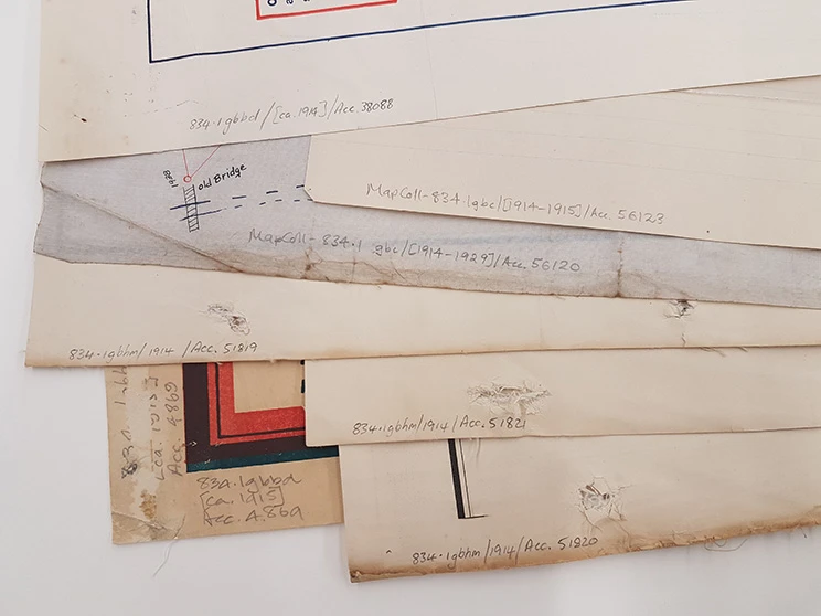
Call numbers written on maps of old Nelson Province (834.1). Photo supplied by Alexander Turnbull Library.